
Mister Bower
Website & Web App
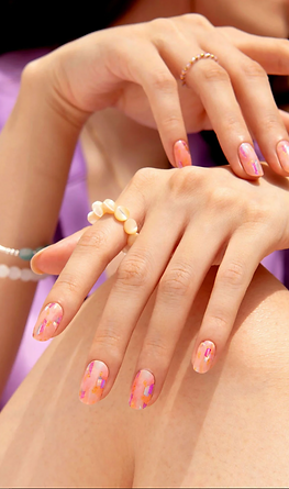
Mister Bower is a gel nail strip design brand founded by a fashion designer. They provide modern and simple designs for people to effortlessly follow the trend everyday.
My team and I created a website and a web app to showcase their products online and enhance their brand identity and presence by giving
a strong impression.
Role
Team-Driven
Duration
2 Months
Tools
Figma, Adobe Photoshop, Adobe Illustrator
Project Scope
UI/UX Design
Website


Web App


Project Overview
Objectives
01
Build a website & app that establish the brand's online presence through customer engagement.
02
Create an online shopping mall to provide customers with a seamless shopping experience.
03
Enhance brand visuals and identity that increases recognition by customers.
Brand Research
Mister Bower focuses on fashionable salon-quality nail care products, available at Sephora Korea. It offers quick, easy-to-use gel strips with innovative designs collaborated with top designers and trendsetters, including nail care essentials, and nail art accessories.
The brand empowers women with confidence and professionalism under the slogan, "Love My Desire," and gifts customers with enjoyable daily moments.


Mister Bower's product packaging design uses brand color and keyword.
Brand keywords: Minimal, Classic, Grace.
Brand colors:
Primary
#C9E3EF
#121212
Neutral
#FFFFFF
#C9C4BF
#5F5B57
#D0BFAD
Accent
#E20008
#F8D4D4


Design Process
01
Project Overview
Objectives
Brand Research
02
Design
UI Style Guide
Wireframe
03
Protype
Final Prototype
Design
UI Style Guide
We designed wireframes and prototypes based on the brand keywords and brand colors. The UI design is very aesthetically and functionally straight forward that leads to a focused UX interaction and easy shopping.
Button & Icon
Web
Register
150
430
Web & Web App
Web App
COLLECTION
45
230
Type
Text Style
Size
Roboto Bold
Roboto Regular
Heading Style
14 pt
11 pt
Size
The font's geometric, minimal form enhanced legibility and professional appearance. At the same time, the slight touch of san-serif form possessed modern elegance that visually conveyed the brand's message to support today's confident women.
Palo Bold effectively gave clarity and boldness to the website headings for it to stand out against the complex backgrounds in the images. Its cursive form maintained consistent with the brand's feminine and aesthetic concept.
Wireframes
We focused on utilizing full screen images, and more on content organization as we emphasized simplicity with layout for website and web app.
Landing Page
Web / Web App


Collection Page
Web / Web App


How To
Web / Web App


Other Projects


